Hill’s Global Refresh: Scaling Human-Centric Science
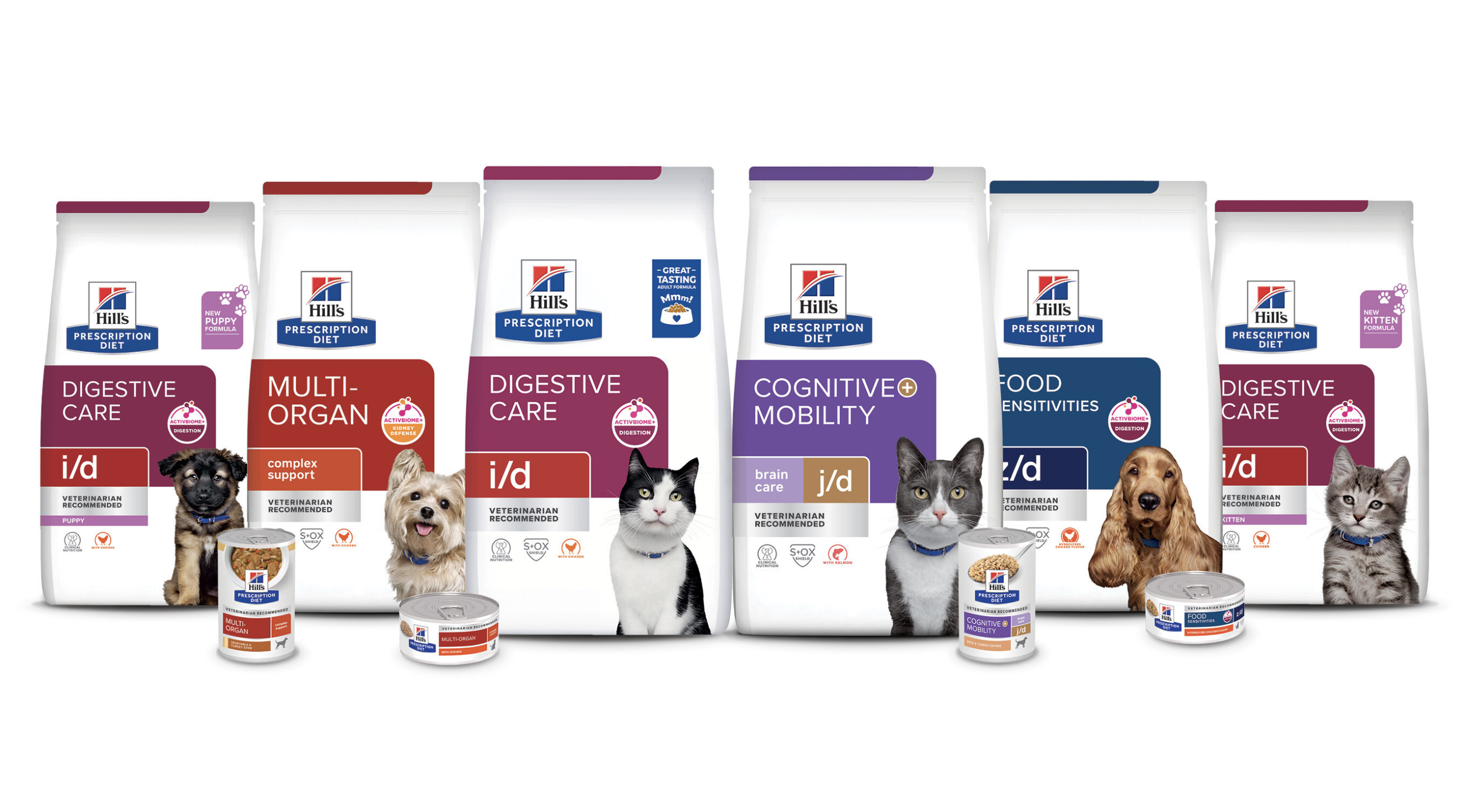
MY ROLE: I led the global brand transformation of Hill’s flagship portfolio, distilling a complex therapeutic range into a cohesive, consumer-centric design system. I orchestrated a cross-continental collaboration across four regions, balancing global synergy while addressing local commercial realities.
SKILLS: Design orchestration, cross-functional leadership, D2A process optimization, multidisciplinary creative resource management, art direction, design adaptation
DESIGN AGENCY PARTNERS: Beardwood and Aquent
CHALLENGE
Modern pet parents are deeply committed to making informed, proactive decisions for their pets' health. However, Hill’s legacy clinical aesthetic—while authoritative—created a barrier to emotional connection.
WORKSHOP: TEAM BUILDING & PRE-DESIGN LEARNING
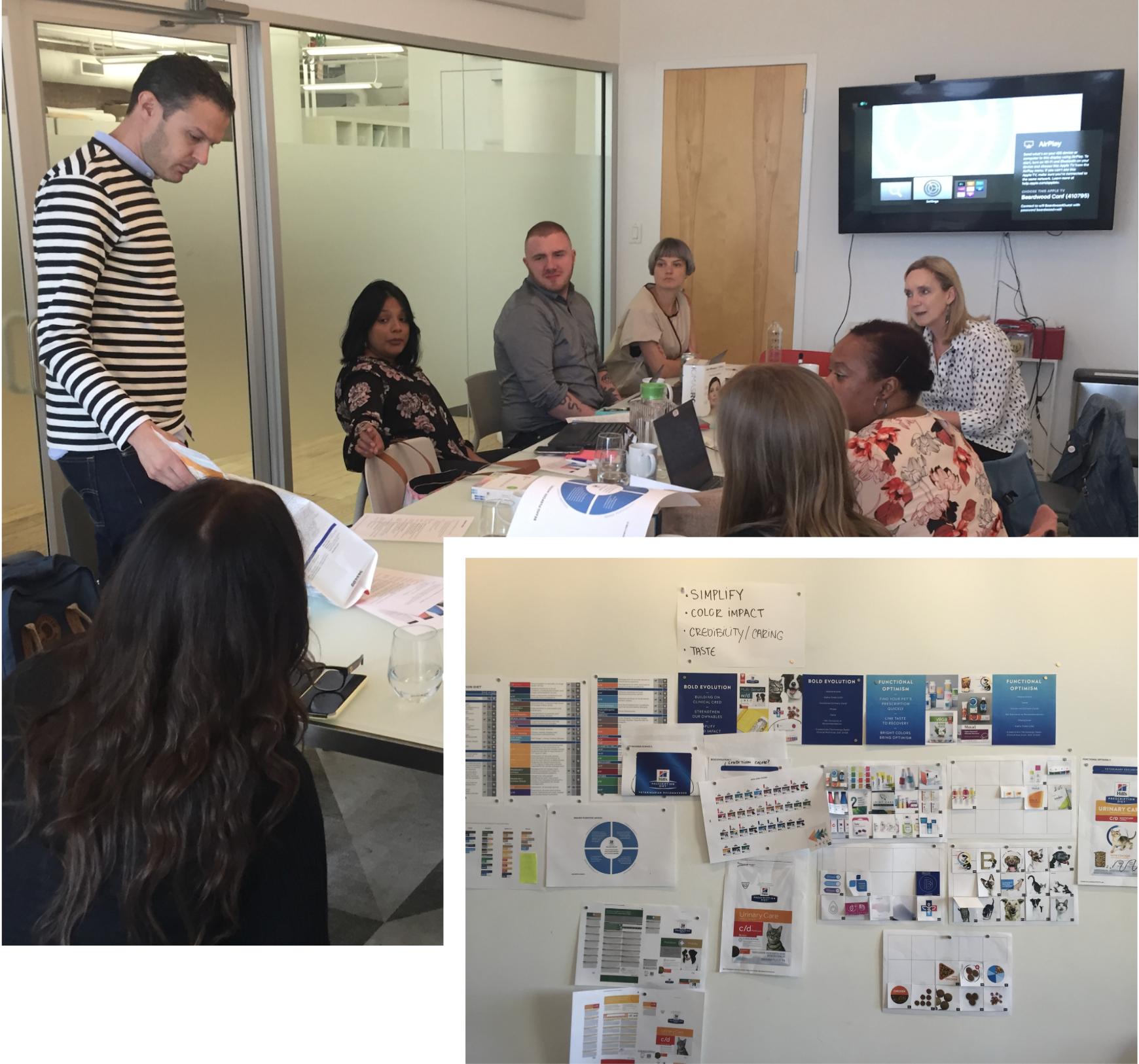
I orchestrated a two-day immersion in NYC, bringing together Kansas-based marketing and insights teams to foster collaboration and strategic clarity. We distilled category trends, consumer learning and internal business pressures to co-create a scalable design strategy, ensuring that the foundational "Design DNA" was built on shared goals and measurable success metrics.
STRATEGIC INSIGHTS & GUARDRAILS
Through this immersive pre-design phase, we identified the critical levers for the Hill’s brand evolution:
Clinical Utility: We recognized that for veterinary technicians, the package must function as a informational tool, ensuring effortless navigation within high-volume clinic stockrooms.
Segment Innovation: While brand health remains high, we identified a significant opportunity to elevate "Taste Appeal" within the wet diet segment—transforming a perceived "bland" therapeutic necessity into a premium, appetizing consumer experience.
System Integrity: Consumer learning confirmed that the existing architecture was fundamentally sound, allowing us to focus on optimization rather than a total overhaul.
Equity Preservation: We defined the "non negotiable"—the logo, color-coding system, and clinical script—ensuring our evolution respected the brand ownables.
STRATEGIC DESIGN EXPLORATION
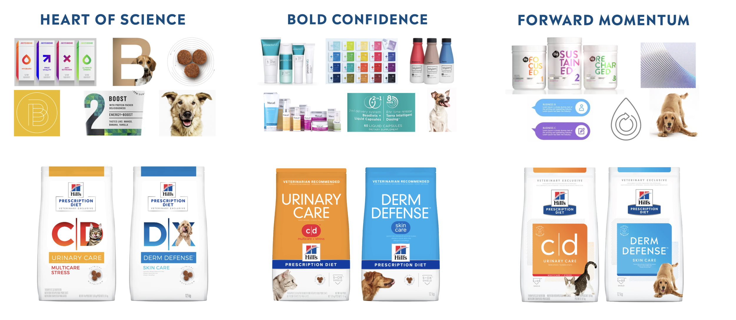
Operating within our defined guardrails, I directed the creative team through a tiered ‘Evolution to Revolution’ framework. Our objective was to develop three distinct design expressions, each grounded in the brand strategy to elicit specific consumer insights. This structured approach allowed us to explore the spectrum of the brand’s visual identity—balancing clinical authority with emotional resonance—while mitigating risk and ensuring a data-driven path to the final selection.
CONSUMER VALIDATION & DESIGN PIVOTS
Our research phase yielded critical insights into the brand's visual semiotics, allowing us to fine-tune the balance between clinical authority and emotional appeal:
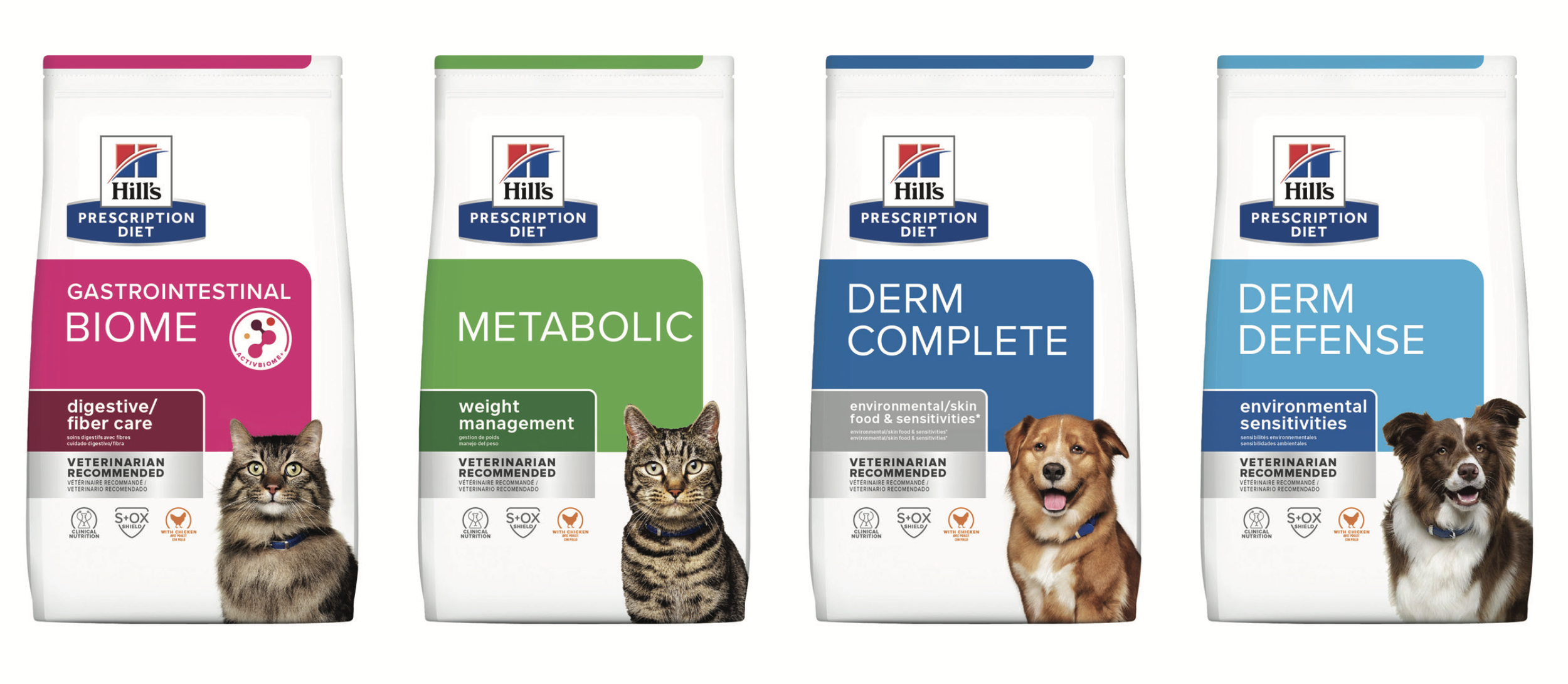
Premium Visual Cues: We discovered that an over-saturation of color signaled "mass-market" rather than "specialized nutrition." By introducing a more disciplined color palette, we reinforced the brand’s premium, therapeutic positioning.
Balancing the Clinical Lens: While white is synonymous with science, excessive use created a "cold" and "unapproachable" perception. We pivoted to a more nuanced use of negative space to retain clinical trust without sacrificing warmth.
Dynamic Imagery: Moving the pet photography beyond the traditional "box" constraints was a breakthrough. This shift signaled vitality and life, transforming the pet from a "patient" into a "living, thriving companion."
Optimizing Brand Equity: Testing confirmed that anchoring the logo on a clean, white field significantly increased shelf standout and brand recall, ensuring the Hill’s mark remained the primary focal point
SOLUTION
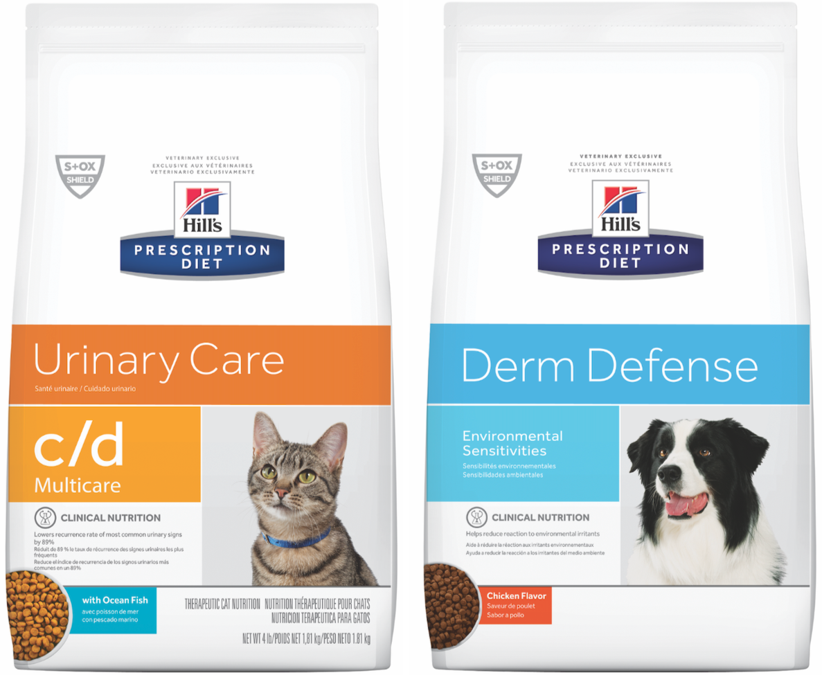
Before
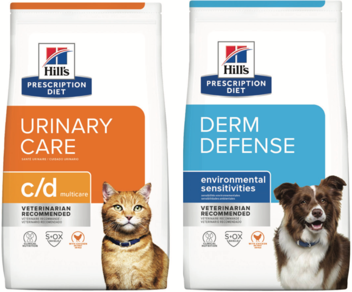
After
OMNI-CHANNEL COHESION: NAVIGATING THE CONSUMER JOURNEY
With the strategic design direction anchored, I shifted my focus to overseeing the design development of the communication system across a diverse portfolio.
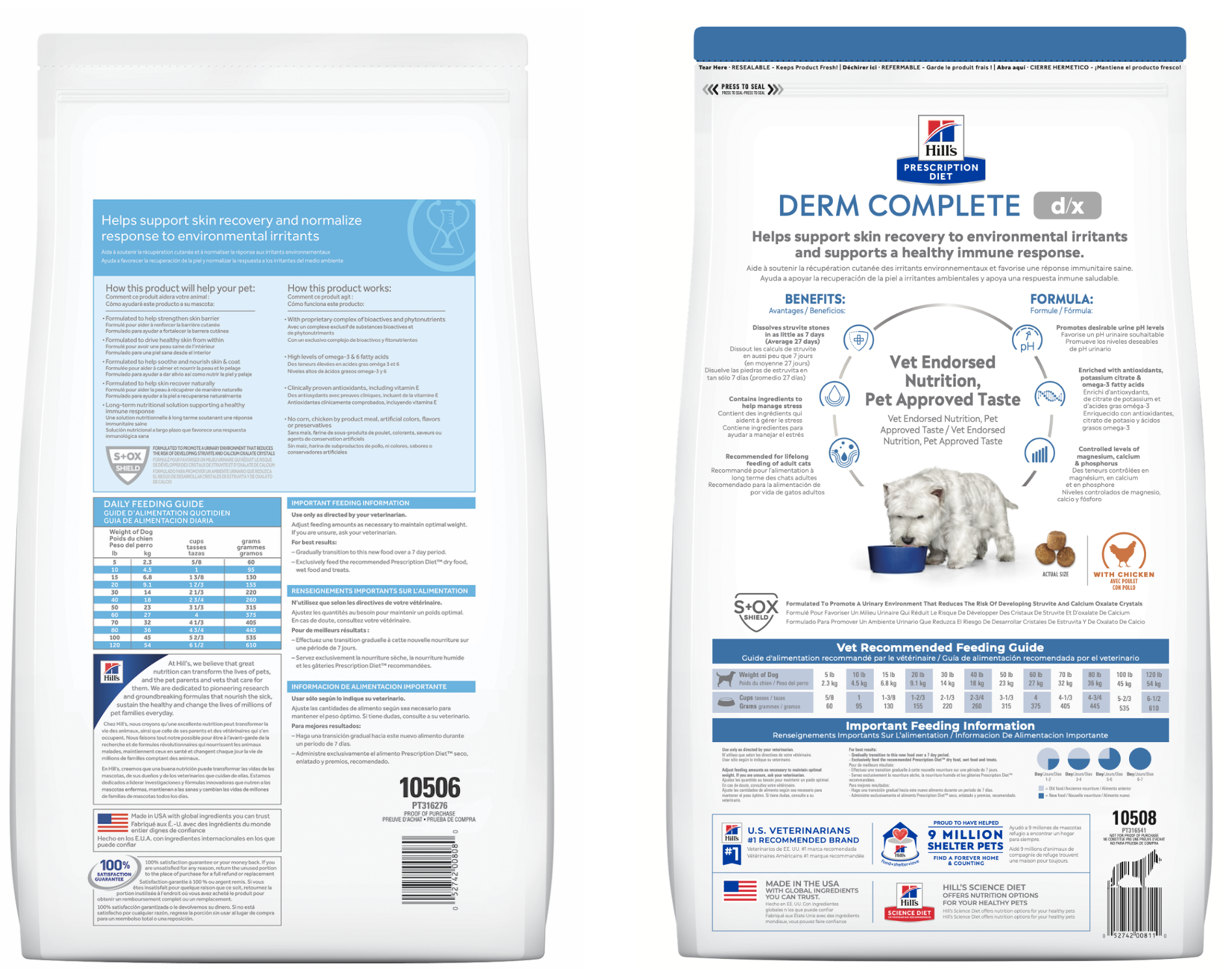
Before
After
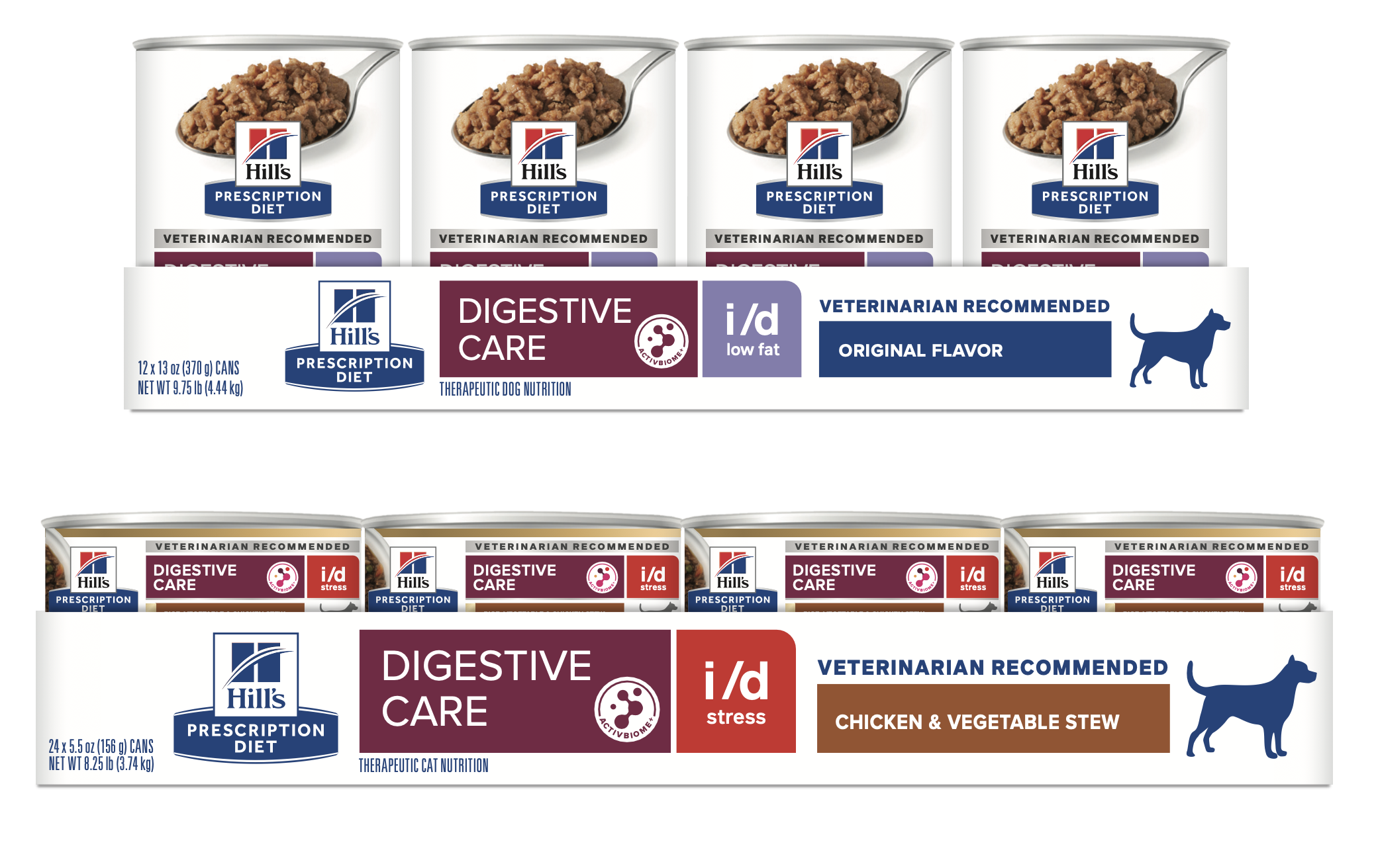
The back-of-pack experience I directed a complete overhaul of the back-label hierarchy, transforming it into a high-functioning educational asset designed to help veterinarians and pet parents to more easily identify the right food for their pets.
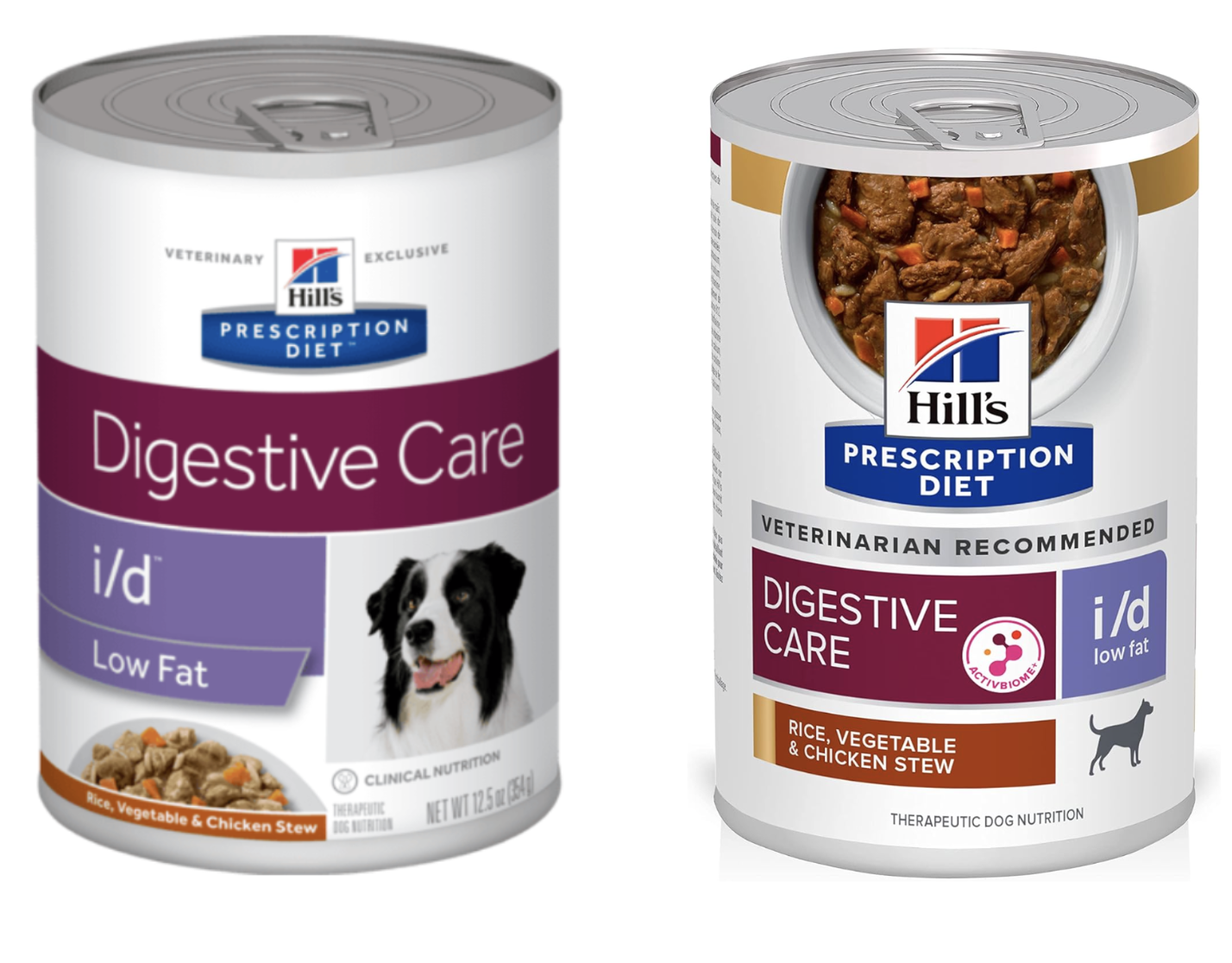
Before
After
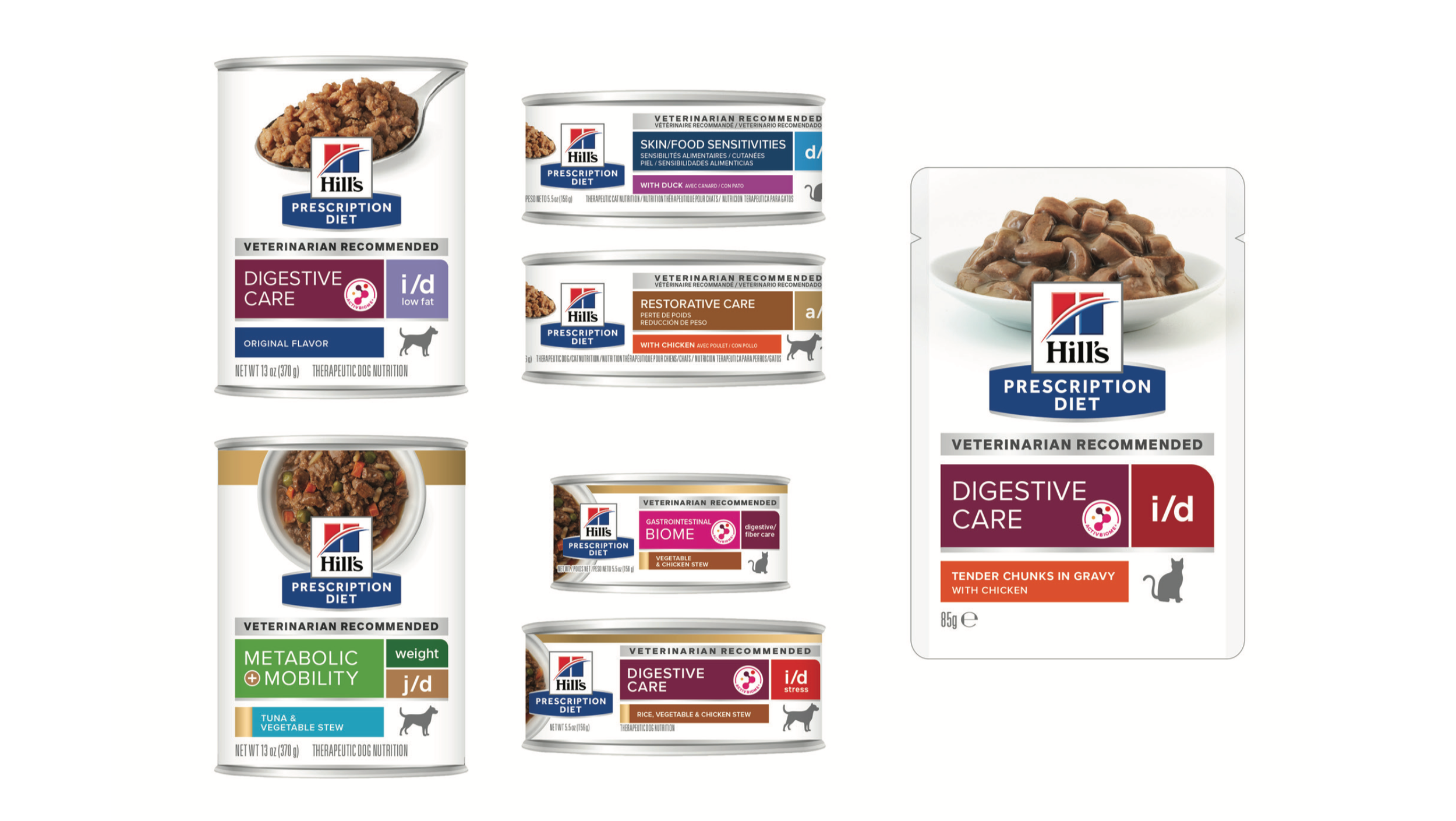
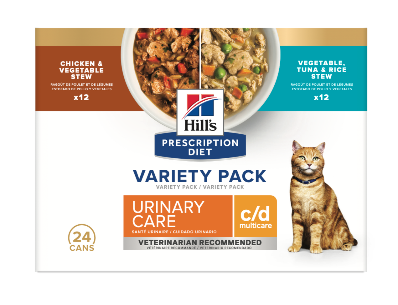
Elevating tase appeal by placing the food photography at the focal point of the label, we addressed a key consumer behavior: pet parents frequently use wet diets as flavor enhancers.
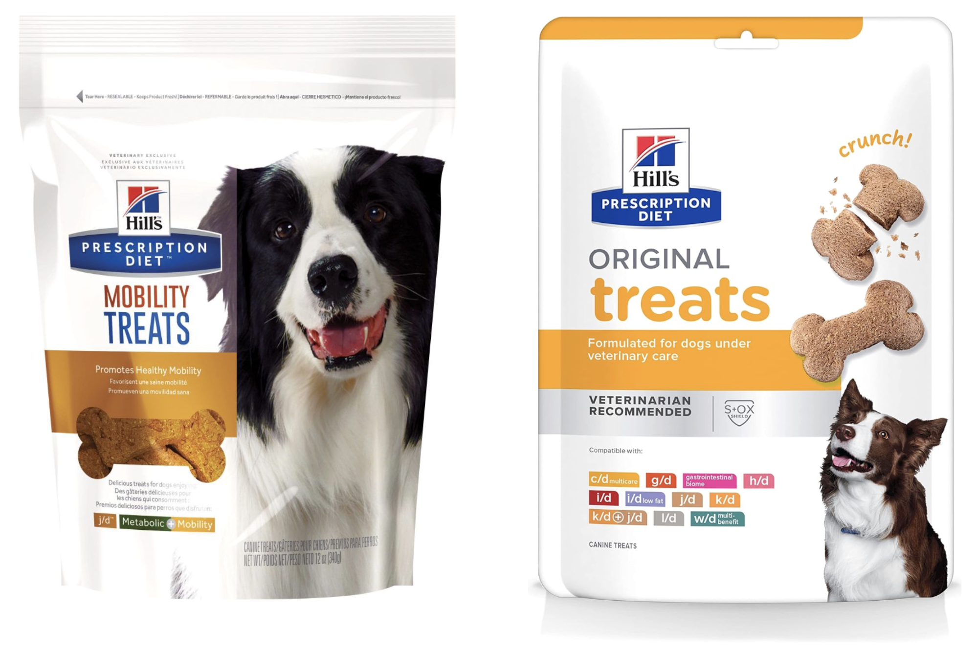
Before
After
To prevent the brand from feeling overly clinical or sterile, we introduced subtle, human-centric design elements to inject a sense of approachable warmth.
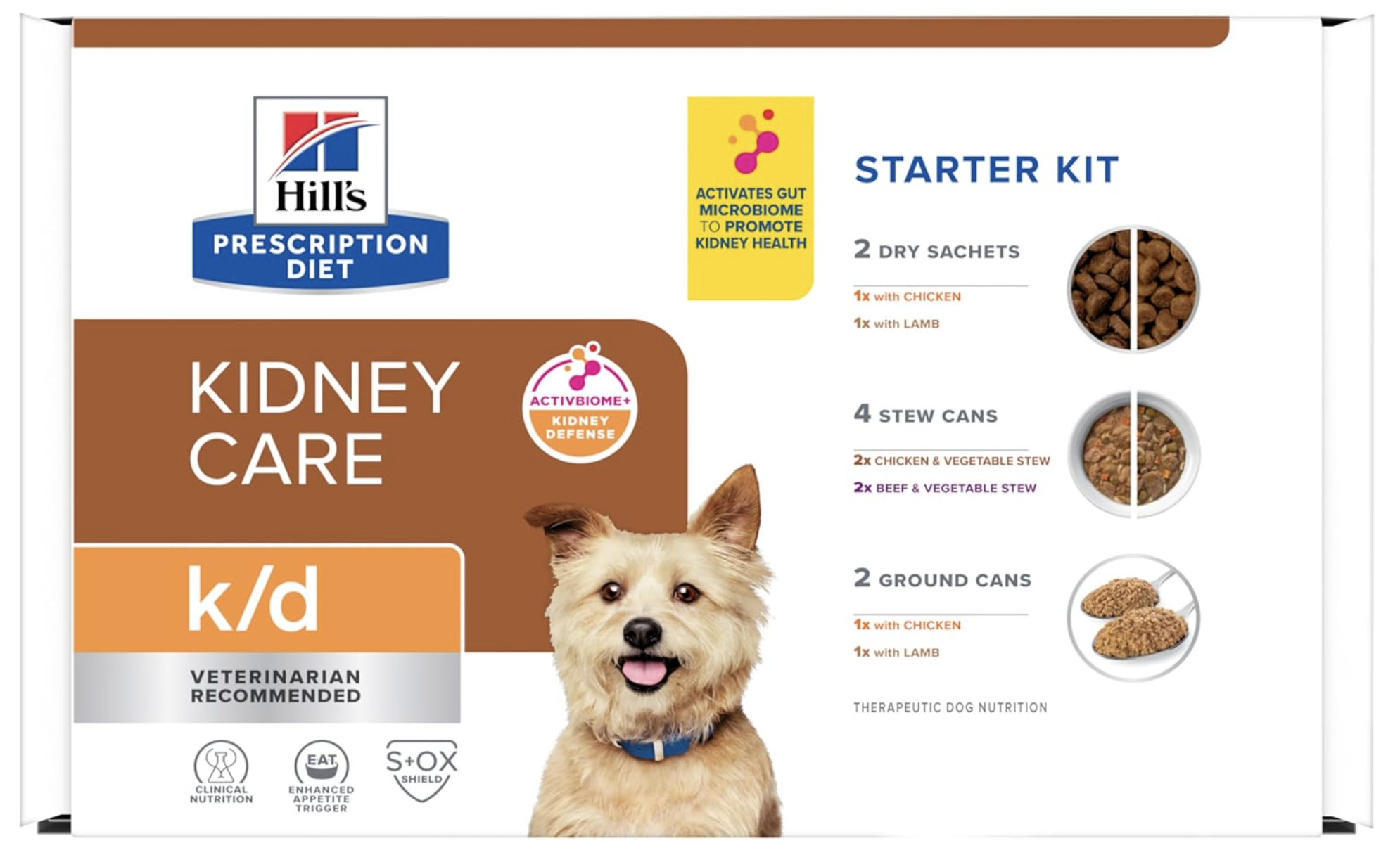
Post care starter Kit serves as a convenient, cost effective tool to test different wet and dry food options to find what a picky pet with reduced appetite will eat.
THE ROAD TO COMMERCIALIZATION
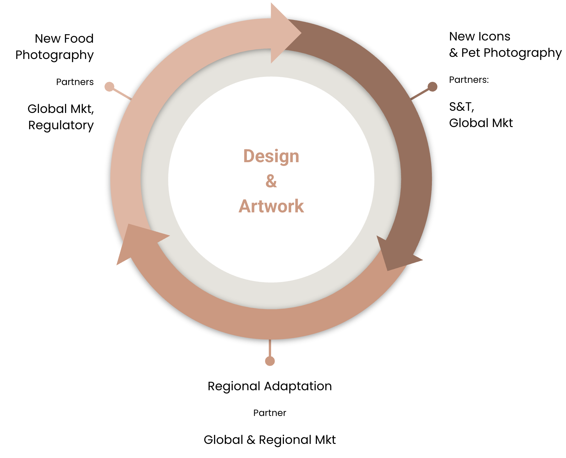
In parallel with the creative evolution, I spearheaded the development of the global packaging visual assets, navigating a rigorous multi-stakeholder approval process. Given Hill’s position as a clinical authority, ensuring the integrity of every visual component was critical.